In this tutorial I will share the steps to add a call to action button to the Divi Menu.
The codes below will work for both the default Divi theme menu and the menu module.
1. Add Custom CSS Class to the Menu Item
The first step is to add a custom CSS class to the menu item that you want to style in to a button.
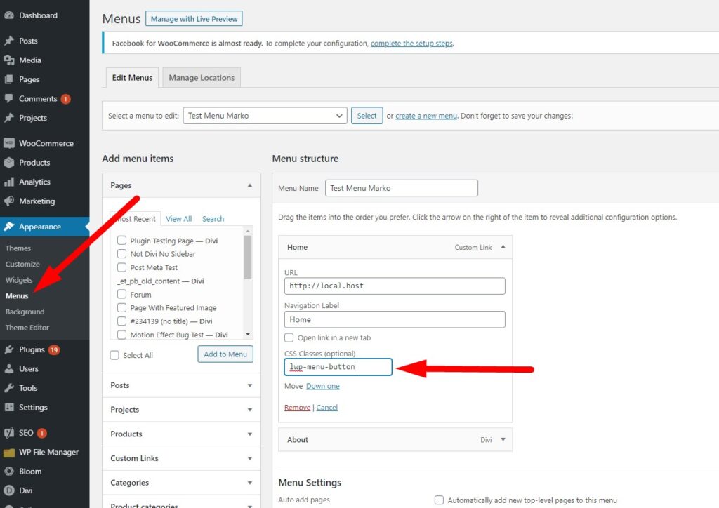
To add a CSS class to the menu item go to your WordPress Dashboard > Appearance > Menus. Open and expand the menu item toggle that you want turned in to a button.
And then add lwp-menu-button in the CSS Classes input box.
If you are not sure where to add it then here is a screenshot to help you.
2. Add Custom CSS Code to the Theme Options
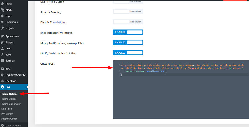
Next go to your WordPress Dashboard > Divi > Theme Options > General > Custom CSS. And add the below code in it.
@media (min-width: 981px) {
    .lwp-menu-button a {
        line-height: 9px;
        font-weight: 600;
        padding: 18px 16px!important;
        text-transform: uppercase;
        display: block;
        padding-left: 32px!important;
        padding-right: 32px!important;
        border-radius: 50px;
        -webkit-border-radius: 50px;
        -moz-border-radius: 50px;
        text-align: center;
        border: 0px;
        font-size: initial!important;
        color: #fff!important;
        background-color: #f92c8b;
    }

    .lwp-menu-button a:hover {
        opacity: 1!important;
        color: #fff!important;
        background-color: #21c9e2
    }

    /*Removing padding from the menu module to fix the size of the button*/
    .et_pb_menu--with-logo .et_pb_menu__menu>nav>ul>li>a {
        padding-top: 0px;
        padding-bottom: 0px;
    }

    /*vertically center the menu items in menu module*/
    .et_pb_menu .et_pb_menu__menu>nav>ul>li {
        align-items: center;
    }
}
If you are not sure where to add the CSS code in the Theme Options there here is a screenshot to help.
You can change the font size, color and background color for the button before hover on lines 15, 16 and 17. The color and background color on hover can be changed on lines 22 and 23 respectively.
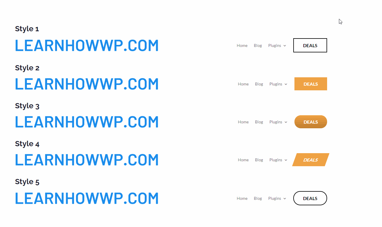
3. More Styles for the Menu Button
Now that you understand a bit about how the code works. I will share a few styles for the menu buttons below. You can edit them to match the colors of your website.
Each style uses a unique css class. You only need to have that specific class added in the Menu item to apply the styles to the menu item.
Here is a preview of all the buttons.
Style 1 – Flat Call to Action Button with Border
To use this style you have to add the class lwp-menu-button-1 to the menu item. Then add the below code to Theme Options > Custom CSS.
@media (min-width: 981px) {
    /*Before hover styles*/
    .lwp-menu-button-1 a {
        line-height: 9px;
        font-weight: 600;
        padding: 18px 16px!important;
        text-transform: uppercase;
        display: block;
        padding-left: 32px!important;
        padding-right: 32px!important;
        text-align: center;
        border-radius: 0; /*change rounder corners here set to 0px for rectangle*/
        border: 2px solid #000; /*change border color here*/
        font-size: initial!important; /*change font size here*/
        color: #000!important; /*change color of text here*/
        background-color: transparent; /*change background color of button here*/
    }
    /*After hover styles*/
    .lwp-menu-button-1 a:hover {
        opacity: 1!important;
        border: 2px solid #21c9e2; /*change border color on hover here*/
        color: #fff!important; /*change text color on hover here*/
        background-color: #21c9e2; /*change backgrund color on hover here*/
    }

    /*Removing padding from the menu module to fix the size of the button*/
    .et_pb_menu--with-logo .et_pb_menu__menu>nav>ul>li>a {
        padding-top: 0px;
        padding-bottom: 0px;
    }

    /*vertically center the menu items in menu module*/
    .et_pb_menu .et_pb_menu__menu>nav>ul>li {
        align-items: center;
    }
}
Style 2 – Call to Action Button with Rounded Corners on Hover
To add this style add the CSS Class lwp-menu-button-2 to the menu item and then add the below code to the Theme Options > Custom CSS.
This styles animates the border corners on hover. It changes flat corners to rounded corners when you hover over it.
If you want the opposite effect, changing rounded corners to flat corners then you can swap the border-radius styles in the hover and before hover styles block.
@media (min-width: 981px) {
    /*Before hover styles*/
    .lwp-menu-button-2 a {
        line-height: 9px;
        font-weight: 600;
        padding: 18px 16px!important;
        text-transform: uppercase;
        display: block;
        padding-left: 32px!important;
        padding-right: 32px!important;
        text-align: center;
        border-radius: 0; /*change rounder corners here set to 0px for rectangle*/
        border: 0; /*change border color here*/
        font-size: initial!important; /*change font size here*/
        color: #fff!important; /*change color of text here*/
        background-color: #f2a338; /*change background color of button here*/
    }
    /*After hover styles*/
    .lwp-menu-button-2 a:hover {
        opacity: 1!important;
        border-radius:50px!important;
        color: #fff!important; /*change text color on hover here*/
        background-color: #21c9e2; /*change backgrund color on hover here*/
    }

    /*Removing padding from the menu module to fix the size of the button*/
    .et_pb_menu--with-logo .et_pb_menu__menu>nav>ul>li>a {
        padding-top: 0px;
        padding-bottom: 0px;
    }

    /*vertically center the menu items in menu module*/
    .et_pb_menu .et_pb_menu__menu>nav>ul>li {
        align-items: center;
    }
}
Style 3 – Call to Action Button Enlarges on Hover
To enlarge the button on hover add the class lwp-menu-button-3 to the menu item and use the below code in Theme Options > Custom CSS.
@media (min-width: 981px) {
    /*Before hover styles*/
    .lwp-menu-button-3{
        transition:0.5s ease all;
    }
    .lwp-menu-button-3 a {
        line-height: 9px;
        font-weight: 600;
        padding: 18px 16px!important;
        text-transform: uppercase;
        display: block;
        padding-left: 32px!important;
        padding-right: 32px!important;
        text-align: center;
        border-radius: 50px; /*change rounder corners here set to 0px for rectangle*/
        border: 0; /*change border color here*/
        font-size: initial!important; /*change font size here*/
        color: #fff!important; /*change color of text here*/
        background-image: linear-gradient(180deg,#f2a338 0%,rgb(162 102 21 / 60%) 100%);
        background-color: #f2a338;
       }
    /*After hover styles*/
    .lwp-menu-button-3:hover{
            transform:scale(1.1);
     }
    .lwp-menu-button-3 a:hover {
        opacity: 1!important;
        color: #fff!important; /*change text color on hover here*/
        background-color: #f2a338; /*change backgrund color on hover here*/
    }

    /*Removing padding from the menu module to fix the size of the button*/
    .et_pb_menu--with-logo .et_pb_menu__menu>nav>ul>li>a {
        padding-top: 0px;
        padding-bottom: 0px;
    }

    /*vertically center the menu items in menu module*/
    .et_pb_menu .et_pb_menu__menu>nav>ul>li {
        align-items: center;
    }
}
Style 4 – Skewed Call to Action Button with Hover Effect
This code skews the button and returns it back to its original shape on hover.
To add this style you need to use the CSS Class lwp-menu-button-4 on the menu item and then add the code below to Theme Options > Custom CSS.
@media (min-width: 981px) {
    /*Before hover styles*/
    .lwp-menu-button-4 {
        background-color: #f2a338; /*change background color of button here*/
        -ms-transform: skewX(-20deg);
        -webkit-transform: skewX(-20deg);
        transform: skewX(-20deg);
        transition: 0.4s all ease;
    }
    .lwp-menu-button-4 a {
        line-height: 9px;
        font-weight: 600;
        padding: 18px 16px!important;
        text-transform: uppercase;
        display: block;
        padding-left: 32px!important;
        padding-right: 32px!important;
        text-align: center;
        border-radius: 0; /*change rounder corners here set to 0px for rectangle*/
        border: 0; /*change border color here*/
        font-size: initial!important; /*change font size here*/
        color: #fff!important; /*change color of text here*/
        -ms-transform: skewX(20deg);
        -webkit-transform: skewX(20deg);
        transform: skewX(20deg);
    }
    /*After hover styles*/
    .lwp-menu-button-4:hover {
        background-color: #21c9e2; /*change backgrund color on hover here*/
        -ms-transform: skewX(0deg);
        -webkit-transform: skewX(0deg);
        transform: skewX(0deg);
    }
    .lwp-menu-button-4 a:hover {
        -ms-transform: skewX(0deg);
        -webkit-transform: skewX(0deg);
        transform: skewX(0deg);
        opacity: 1!important;
        color: #fff!important; /*change text color on hover here*/
    }

    /*Removing padding from the menu module to fix the size of the button*/
    .et_pb_menu--with-logo .et_pb_menu__menu>nav>ul>li>a {
        padding-top: 0px;
        padding-bottom: 0px;
    }

    /*vertically center the menu items in menu module*/
    .et_pb_menu .et_pb_menu__menu>nav>ul>li {
        align-items: center;
    }
}
Style 5 – Call to Action Button with Rounded Corners
This style is very similar to the Style 1 above. It just has rounded corners. To add this style add the class lwp-menu-button-5 to the menu item and the the code below in Theme Option > Custom CSS.
@media (min-width: 981px) {
    /*Before hover styles*/
    .lwp-menu-button-5 a {
        line-height: 9px;
        font-weight: 600;
        padding: 18px 16px!important;
        text-transform: uppercase;
        display: block;
        padding-left: 32px!important;
        padding-right: 32px!important;
        text-align: center;
        border-radius: 50px; /*change rounder corners here set to 0px for rectangle*/
        border: 2px solid #000; /*change border color here*/
        font-size: initial!important; /*change font size here*/
        color: #000!important; /*change color of text here*/
        background-color: transparent; /*change background color of button here*/
    }
    /*After hover styles*/
    .lwp-menu-button-5 a:hover {
        opacity: 1!important;
        border: 2px solid #21c9e2; /*change border color on hover here*/
        color: #fff!important; /*change text color on hover here*/
        background-color: #21c9e2; /*change backgrund color on hover here*/
    }

    /*Removing padding from the menu module to fix the size of the button*/
    .et_pb_menu--with-logo .et_pb_menu__menu>nav>ul>li>a {
        padding-top: 0px;
        padding-bottom: 0px;
    }

    /*vertically center the menu items in menu module*/
    .et_pb_menu .et_pb_menu__menu>nav>ul>li {
        align-items: center;
    }
}
4. Adding an Icon to the Menu Item
Adding a Icon to the menu item is relatively simple. You can find detailed steps to add an icon in the article How to Add Icons to the Divi Menu. I will recommend that you read it for the complete instructions. The shorter version is below.
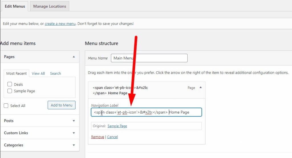
The first step is to find the icon code for the icon that you want to add your menu item from the Divi website Elegant Icons Fonts.
Next you have to enclose the icon code in the span tags.
<span class='et-pb-icon'>Code for the Icon Here</span>
And add this code in the Menu Text.
Leave a comment below if you found this helpful or have any questions. Don’t forget to subscribe to the Newsletter to receive the latest tutorials in your inbox.
0 Comments