Do you want to make the header Fixed on Mobile in Divi theme?
In this article you will find step by step by step instructions to make the mobile header fixed in Divi theme.
Before you read further it is important to understand that the code will only work for the default header. The code will not work for a header built with Divi Theme Builder. If you have built your header using Theme Builder then you should be using Sticky Feature to make your menu sticky.
The problem is that the mobile header and menu in the Divi theme is not fixed or sticky by default. Even when you are using fixed header for desktop the mobile menu still does not become sticky when you scroll down the page.
There are no options in the Divi theme to make the mobile menu sticky.
However it can be made sticky with a Snippet of CSS Code.
Add CSS Code to Make Mobile Header Fixed
To make the mobile header sticky you have to add the code below to your website.
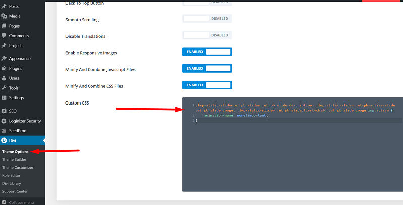
Go to your WordPress Dashboard > Divi > Theme Options > Custom CSS and then add the following CSS code.
.et_fixed_nav #main-header {
    position: fixed;
}
If you are not sure where to add the CSS Code then please check the screenshot below.

Once you have added the code in the Divi Theme Options then the mobile header should become fixed.
It will be fixed to the top as you scroll down the page.
Leave a comment below if you have any questions. Don’t forget to subscribe to the Newsletter to receive the latest tutorials in your inbox.
Here are some more Divi tutorials that you can check next.
- Add Cart Icon With Item Count and Price In Theme Builder
- How to Change Arrow Color in Gallery Module Divi Theme
- How to Create a Vertical Menu with Divi Menu Module
You can find a complete list of all the help articles related to Divi on the Divi Tutorials page.
0 Comments