In this article I will share the steps to replace hamburger menu icon with text in Divi theme.
On tablets and phones the menu turns in to a drop down menu with an icon. The hambuger icon is used to open and close the menu.
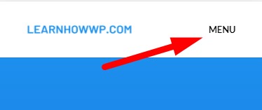
In this tutorial we will both, replace the hamburger icon with custom text and also show text by the side of hambuger icon. Here is a screenshot of how it will look like at the end.

This article is for adding custom text by the side of the icon. If you are looking to show the desktop menu on mobile instead then please check Disable Mobile Menu (Hamburger Menu) in Divi Theme Header or Menu Module depending on what you are using for the menu.
Custom CSS Add Custom Text in Hamburger Menu
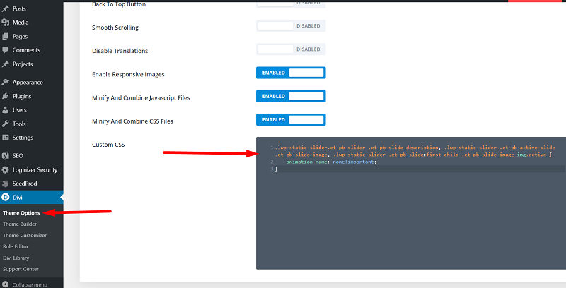
To add custom text to the side of the icon. Go to your Dashboard > Divi > Theme Options > Custom CSS and then add the below code.
.mobile_menu_bar:after {
    content: "MENU";
    position: relative;
    color: #000!important;
    cursor: pointer;
    font-size: 13px;
    vertical-align: text-top;
}
You can change the MENU text in the code to change the text next to the icon.
If you are not sure where to add the code then here is a screenshot to help.

You can also change the color and font size for the text inside the code by adjusting the font-size and color values.
Custom CSS Replace Hamburger Menu With Text
Now since we have already added custom text next to the icon all we need to do is remove the icon and only keep the text. To only keep the text and hide the menu icon you can use the below code instead.
.mobile_menu_bar:after {
    content: "MENU";
    position: relative;
    color: #000!important;
    cursor: pointer;
    font-size: 13px;
    vertical-align: text-top;
}

.mobile_menu_bar:before {
    opacity: 0;
}
Custom CSS Change Text When Menu Open
To change the text when menu is opened you just have to add the below code in addition to the code above to your Custom CSS.
.opened .mobile_menu_bar:after {
    content: "CLOSE";
}
Here are more Divi tutorials that you can read next.
- How To Change Number of Columns in Divi Mega Menu
- How To Add Buttons Side By Side In Divi Theme
- Remove Download Option from Video in Divi Video Module
Leave a comment below if you have any questions. Don’t forget to subscribe to the Newsletter to receive the latest tutorials in your inbox.
0 Comments