In this article I will share the CSS Code and the steps to change the number of columns in a Portfolio module in the Divi theme.
The code can used to change the column number when the Portfolio module is set to use the Grid layout. The codes shared below will work on both the Filterable Portfolio module and the Portfolio module.
1. Add CSS Class To The Divi Portfolio Module
The first thing that you need to is add a CSS Class the Portfolio module. We normally add a class in the module so that we only apply the code to a specific module on the website and not affect any other modules on the website.
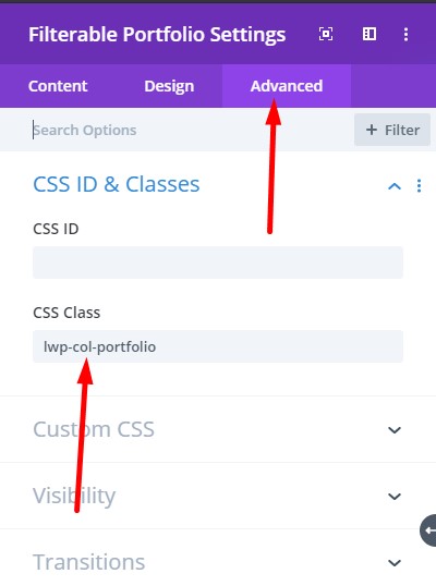
The CSS Class can be added at Portfolio Module Settings > Advanced > CSS ID & Classes > CSS Class. For this tutorial we are going to add the class lwp-col-portfolio to the portfolio module settings.
If you are not sure here is a screenshot to help you understand where to add the CSS Class.

2. Add CSS Code to Change The Number of Columns
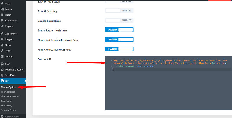
After adding the CSS Class to the Portfolio module you need to add the following CSS Code in the Theme Options of your website.
Please go to your WordPress Dashboard > Theme Options > General > Custom CSS and add the code below. This code will change the number of columns in the Portfolio module from 4 columns to 3 columns.
@media (min-width: 981px) {
    .lwp-col-portfolio .et_pb_grid_item {
        width: 29.66%!important;
        margin-right: 5.5%!important;
    }

    .lwp-col-portfolio .et_pb_grid_item:nth-child(3n) {
        margin-right: 0!important;
    }

    .lwp-col-portfolio .et_pb_grid_item:nth-child(4n) {
        margin-right: 5.5%!important;
    }

    .lwp-col-portfolio .et_pb_grid_item.et_pb_portfolio_item:nth-child(4n+1) {
        clear: none!important;
    }
    .lwp-col-portfolio .et_pb_grid_item.first_in_row {
        clear: unset;
    }
}
If you are not sure where to add the code then here is a screenshot to help you.

If you want to change the number of columns in the Portfolio module to 2 columns, 5 columns or 6 columns then you can use the codes that are listed below.
Code to Change The Number of Columns To 2
@media (min-width: 981px) {
    .lwp-col-portfolio .et_pb_grid_item {
        width: 47.25%!important;
        margin-right: 5.5%!important;
    }

    .lwp-col-portfolio .et_pb_grid_item:nth-child(3n) {
        margin-right: 5.5%!important;
    }

    .lwp-col-portfolio .et_pb_grid_item:nth-child(2n) {
        margin-right: 0!important;
    }

    .lwp-col-portfolio .et_pb_grid_item.et_pb_portfolio_item:nth-child(4n+1) {
        clear: none!important;
    }

    .lwp-col-portfolio .et_pb_grid_item.first_in_row {
        clear: unset;
    }
}
Code to Change The Number of Columns To 5
@media (min-width: 981px) {
    .lwp-col-portfolio .et_pb_grid_item {
        width: 15.6%!important;
        margin-right: 5.5%!important;
    }

    .lwp-col-portfolio .et_pb_grid_item:nth-child(3n) {
        margin-right: 5.5%!important;
    }

    .lwp-col-portfolio .et_pb_grid_item:nth-child(5n) {
        margin-right: 0!important;
    }

    .lwp-col-portfolio .et_pb_grid_item.et_pb_portfolio_item:nth-child(4n+1) {
        clear: none!important;
    }

    .lwp-col-portfolio .et_pb_grid_item.first_in_row {
        clear: unset;
    }
}
Code to Change The Number of Columns To 6
@media (min-width: 981px) {
    .lwp-col-portfolio .et_pb_grid_item {
        width:12.0833%!important;
        margin-right: 5.5%!important;
    }

    .lwp-col-portfolio .et_pb_grid_item:nth-child(3n) {
        margin-right: 5.5%!important;
    }

    .lwp-col-portfolio .et_pb_grid_item:nth-child(6n) {
        margin-right: 0!important;
    }

    .lwp-col-portfolio .et_pb_grid_item.et_pb_portfolio_item:nth-child(4n+1) {
        clear: none!important;
    }

    .lwp-col-portfolio .et_pb_grid_item.first_in_row {
        clear: unset;
    }
}
Next you can checkout some other Divi tutorials from our Blog such as How to Autoplay Videos in the Divi Video Module or How to add Labels above Input Fields in the Contact Form Module.
Leave a comment below if you found this helpful or have any questions. Don’t forget to subscribe to the Newsletter to receive the latest tutorials in your inbox.
Hi there, just tried the method and works just fine.
Yet I want no gutter space between images. I have it set so in the module but understand the custom CSS overrides such settings.
How can I set to “none” this blank space between images?
Thank you!
You can change the margin-right and width values in the code. The margin-right should always be set to 0% and the width can be calculated by dividing 100 by the number of columns. So for a 5 column module the width would be 100/5 = 20%.
this is fantastic. the 3 column layout looks so much better, but i’m having an issue on desktop once it gets past the 9th item in the filterable portfolio. i have 3 rows of three columns, then 2 rows of two columns, then on the sixth row it goes back to three columns, but the last column has no margin between it and the second column. the last row in the portfolio has one image in the third column with no margin top or side…
not sure how to fix it. have you ever had this issue?
thank you
Hi, i have the same probleme when i have more than 9 projects showing on desktop. Thank 😉
Can you please try removing this code.
.lwp-col-portfolio .et_pb_grid_item:nth-child(4n) {margin-right: 5.5%!important;
}
If it does not help then can you share a link to the page.
THANKS it’s perfect ! thanks so much 🙂
Thanks so much!
Glad to know it helped.
Your method helped me a lot! And how could I leave more space between each row of the portfolio? Controlling the padding-bottom to which class?
Thank you very much!
Please try this code.
.lwp-col-portfolio .et_pb_grid_item {margin-bottom:20px;
}
Hello I used your method, but in the site I am setting looks ugly. Can I use this method with fullwidth portfolio?
This code cannot be used for the Fullwidth Portfolio module. It will only work for the default portfolio modules. I will look in to it later and write another blog post for it if possible.
Curious if there has been any progress on the fullwidth porfolio version as I too am interested.
The fullwidth portfolio is really complicated as it works like carousel slider.
Unfortunately it would be a lot complicated to change the columns inside it and cannot be done just by CSS.